Monday, October 18, 2010

Design as conversation:


(Pictures taken from Google images)


(Pictures taken from Google images)


(Pictures taken from Google images)

The Palace of Alhambra is one of the best examples of topic “design as conversation,” because the whole palace discuss its past and existence.
It doesn't matter if a person knows that this palace was built by Moors because one sight of this building will tell him who created this magnificent building.
pastedGraphic.pdf                      pastedGraphic_1.pdf

(Pictures taken from Google images)
The Palace of Alhambra was built in 14th century by Moorish rulers in Granada, Spain. Alhambra in Arabic means “the red,” Moors called it the red fortress.The building is full of Islamic Calligraphy, which is the most important part of Islamic architecture. 
Another common part of Islamic architecture is Mocarabe, which are used on the capitals of the columns of this palace. The whole palace is full of minute and beautiful patterns containing Arabic characters. Patterns are in red, blue, black, and gold colors. The palace is full of floral and geometric designs which is also an important part of Islamic Architecture. 

All around the world most of the Islamic architecture is similar, which consist of arches, domes, minarets, vaults, freezes, Mocarabe, Arabic calligraphy, floral and geometric patterns. An Islamic building weather it is in middle-east, Asia, Europe or any other part of the world must be based on these architectural structures.

The palace of Alhambra has a lot to see in it like the Gate of Justice, The court of Lions, the fountains, The Hall of Ambassadors; The Tower of Canaries; The Court of Myrtles, The Hall of Justice, many gardens, chambers, towers and balconies.
Alhambra has been an inspiration for many artists for their designs, songs, novels, and movies due to its panoramic view which is very romantic.   
Through out history the most desired subject of human longing has been immortality and knowing that the end is imminent makes this desire even stronger. Only the wise have realized that the true path to immortality is to leave behind a legacy larger than life that may stand the tests of time.

Some follow this path to immortality through creating a legacy out of waging wars. Others create masterpieces of arts and literature but the most inspiring legacy is written in the stone through architectural designs that tell tales of the creativity of their designers through ages.
The most beautiful of these stories is told by a Moorish Palace that stands in a Christian land as a monument to the craftsmanship and designing insight of its long lost creators. Through these lines I will let “ ALHAMBRA” tell Its story.

Comparison and Contrast:
Coca Cola and Pepsi are the most famous and top notch soft drink brands in the world today. Since they both are the biggest soft drink brands, they have big time rivalry. Pepsi was created by Caleb Bradham who was a pharmacist from North Carolina, where as Coca Cola was created by John Pemberton a Druggist from Georgia. Pepsi was created as a soft drink to serve drug store customers, where as Coca Cola was sold as a medicine at a pharmacy. created as a coca wine and was called Pemberton’s French wine coca.
The ingredients of the classic Pepsi consist of carbonated water, high fructose corn syrup, caramel color, sugar, phosphoric acid, caffeine, citric acid, and natural flavors. The ingredients of classic Coca Cola consist of Carbonated water, sugar, high fructose corn syrup, caffeine, phosphoric acid. Caramel, Natural flavorings. They both have almost the same ingredients other than that Pepsi has citric acid in it. 
Interesting names do attract people, Pepsi and coca cola both have attracted people at a great level. Coca cola and Pepsi are very innovated in the packing of their product. These companies introduced different idea of packing. The Airtight bottle idea is given by the Coca cola, which has revolutionized the bottling and packaging industry. 
Coca Cola have introduced different shapes and materials of bottles all around the world. Its symbol is simple, which is written in white on a red panel. Pepsi has been using deep blue color because blue color is considered as eternally young, joy and openness which targets young people. Pepsi has a blue and red ball.
Pepsi and Coke both have battled to make good adds, but Pepsi has taken more big celebrities in its adds in comparison to coke. A famous add of Pepsi had Brittany Spears, Pink, Beyonce and Enrique Iglesias in it. In Pakistan they have taken famous film star Reema Khan and India they have also casted famous film stars like Shahrukh Khan, Pretty Zinta etc. They have also casted sports personalities like David Beckham and since 1990 the whole Cricket team of Pakistan has been sponsored by Pepsi. Cola Cola has casted celebrities too, like Paula Abdul, Marc Anthony, Christina Aguilera etc. But Pepsi tends to take more fan following on advertisement. 
Pepsi is more famous in India and Pakistan than Coca Cola.They make jingles and adds that complements the colors and idea of these brands.  Majority of these designs and adds target youth, as they are the ones who consumes the soft drinks more. Youth follow celebrity a lot, thats why both Pepsi and Coca Cola has designed adds in which celebrities represents the brand to be stylish.
The designs of these two great brands normally include their original colors which for Pepsi are blue and Coca Cola are red.  


Video

Video
Design as conversation:
The Palace of Alhambra is one of the best examples of topic “design as conversation,” because the whole palace discuss its past and existence.
It doesn't matter if a person knows that this palace was built by Moors because one sight of this building will tell him who created this magnificent building.


(Pictures taken from Google images)


(Pictures taken from Google images)


(Pictures taken from Google images)


(Pictures taken from Google images)


(Pictures taken from Google images)


The Palace of Alhambra was built in 14th century by Moorish rulers in Granada, Spain. Alhambra in Arabic means “the red,” Moors called it the red fortress.The building is full of Islamic Calligraphy, which is the most important part of Islamic architecture. 


The Palace of Alhambra was built in 14th century by Moorish rulers in Granada, Spain. Alhambra in Arabic means “the red,” Moors called it the red fortress.The building is full of Islamic Calligraphy, which is the most important part of Islamic architecture. 

Another common part of Islamic architecture is Mocarabe, which are used on the capitals of the columns of this palace. The whole palace is full of minute and beautiful patterns containing Arabic characters. Patterns are in red, blue, black, and gold colors. The palace is full of floral and geometric designs which is also an important part of Islamic Architecture. 
All around the world most of the Islamic architecture is similar, which consist of arches, domes, minarets, vaults, freezes, Mocarabe, Arabic calligraphy, floral and geometric patterns. An Islamic building weather it is in middle-east, Asia, Europe or any other part of the world must be based on these architectural structures.
    
The palace of Alhambra has a lot to see in it like the Gate of Justice, The court of Lions, the fountains, The Hall of Ambassadors; The Tower of Canaries; The Court of Myrtles, The Hall of Justice, many gardens, chambers, towers and balconies.

Alhambra has been an inspiration for many artists for their designs, songs, novels, and movies due to its panoramic view which is very romantic.   


Person gets into a trans while looking at the pictures of this palace, I personally want to see this great example of Moorish Architecture, I guess I will enjoy this conversation as I can read the Islamic Calligraphy.  


Sunday, October 17, 2010

Admirably Small....

Admirably Small.... 
I was looking at different pictures of shoes from all around the world, and they all were very interesting and beautiful. Then I stumbled upon a very beautiful shoe, which I thought at first to be a decorating piece, until I read more about it and found that its called the Chinese Lotus shoe. There are many articles written on this, in fact UCSF has done research on this shoe, but I just wanted to write what I feel about it as I find it perfect to be a “design in society” topic.  


Picture taken from: Google Images
In Chinese culture, every woman was desired to have a feet that resemble a “three-inch golden lotus.” Chinese men loved women with small feet (may be in general most men like women with small feet), thats why a woman would put a generous amount of time in making her own wedding shoes. A matchmaker would show this shoe to the desired mother-in-law, instead of girl or her picture. Well, that might be great for a woman who doesn’t look great, she doesn't need any surgeries or make up because if she have very small feet she will get married anyway, and most probably to a better person.    


Picture taken from : Google Images
It is not natural for any Grown up human to have a three inch feet, that is why a girls feet were wrapped in cloth for all her life which results in broken toes. Though It is not practiced any more in China, but still it was being practiced until twentieth century which proves that how important a design of a shoe was in Chinese society, and how women would go through all that pain just for this particular design because it provided them the desired feet size. 


There is no doubt that these shoes were beautiful, and are an obvious example of the meticulous hand embroidery that Chinese women use to do. The colors were picked and designs were made according to the occasion.    


Picture taken from: Google Images


Now you girls should decide, do you want to impress guys by your lotus feet or not? All you have to do is to bare the pain of binding you feet, but eventually you will find a nice guy, so it's not a bad deal or is it?.  

Monday, October 11, 2010

Basketry Hat!!

For one of my design classes I had to use a basketry method initially to make a basket. But I used this method to make a hat, something that can be used as a fashion accessory. We see many baskets in the market which are certainly very cheap and anyone can buy them. We have no idea how difficult it is to make a basket, and you can’t appreciate this art until you try making one your self. Baskets are not made by any sort of machines, so all the baskets or related things in the market that you see are hand made. I had never appreciated basketry before until I had to do this assignment. 

(Image by Faizan Dar)

To do basketry you will need yarn, basketry needles and rope, I was thinking that it won’t be very challenging to do, until I started with the practice in class. My teacher showed us the whole procedure. 


I started it in the class, and I was excited that I was getting it until the instructor came and told me that I have to do it again because my pattern is not right. For a minute I felt like not doing it at all because it was consuming a lot of time and energy. When I went home I started it again. I was using the basketry method to make a hat. It took me consecutively 10 hours to complete it, but it was still looking an ordinary thing.
(Image by Faizan Dar)


In order to make it more presentable I took a thick metallic thread which was complementing the color of the yarn. I breaded this thread and let it hang from the cap, and at the end of each string of thread I hanged a bead of similar color. The idea was that the hat will be clipped on the head while the metallic thread will hang in the hair. Then I added some more embellishment to the hat like putting thinner metallic thread of alternate colors and in the end I added some feathers to the hat as well.


(Image by Faizan Dar)


This hat can make you look very fashionable, and while you are wearing this hat you can appreciate the amount of time and effort that has been put into it.

Design from Without


Inspiration is very important for us humans. We can’t do anything without being inspired from the things around us. I get inspiration from the things that I see around me. These includes everyday objects, nature, weather and events that i see on the news. I am very inspired by the old things, I like using old things and making something useful out of them. Its like an achievement. I remember using dry plants to make jewelry, using paper, buttons, laces and ribbons to make greeting cards. I remember once I used a piece of broken clock to make a necklace.

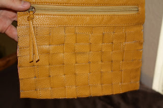
Recently in my design 70 class I got a chance to manifest some of these inspirations in my work. It was a plaiting assignment and Instead of buying new materials I went to the thrift store and bought an old leather bag. It was in very bad condition and it costed me $2. I cut the undamaged part of the purse in to long wide strips. Then I plaited them together, and used the inner cloth of this bag for the lining of this pouch, I also installed  a zipper to make it secure. Each strip was plaited horizontally on to the vertical ones. I used the remaining part of leather to make a bracelet and embellished it with beads. It turned out to be a quite good looking bracelet. Both of these pieces were liked by my professor and peers. I got 96 out of 100 points on that assignment, for being creative and innovative. The pouch can be used as a pencil case, make-up kit or traveling bag. 
(image by faizan dar)

My advice to people is that they should find old things instead of buying new things and turn them into something that can be used in our daily life. This way you will not only save money, but you will also recycle the old material while enjoying your creative side. 

Stone Soup...

In my Design 1 class we were told to bring material for the stone soup activity. Everyone was anxious what we are going to do as we had never heard of a stone soup that was being made without food, and we knew that according to the stone soup story three travelers tricks the villagers to contribute the food that they were hiding, and eventually the cooked food was enjoyed by everyone.  Anyway we went out of the classroom in the courtyard. All of us were pondering upon idea’s for the stone soup collaborating with each other. My group was siting on the grass and we took out all of the materials that we brought for the stone soup activity. Each one of us was coming up with different and interesting idea’s such as making a chandelier or making a lamp by folding a lot of papers. We then saw a light pole next to a tree closer to us, we thought of decorating it with the objects made with different materials that we brought with us. We started folding papers of different colors in to a cone shape and made a whole bunch of those cones. We made origami cranes and flowers. we then took all of these things to the light pole and made a circular stair case with the folded paper cones. Then we hanged cranes to the ropes that were tying the tree to the light pole, and on the tree we wrapped colorful strings and at the bottom we placed the origami flowers. 


(image by Faizan Dar)


It was a colorful and abstract piece of art. The interesting part of this activity is that in the beginning we were not sure of what we will end up making. The process of this stone soup activity was fun. Seven of us in one group contributed what ever we had in our bags, we worked on it without any arguments which was an excellent example of team work. The sad part was that in the end we had to put everything that we made in trash, but we took the origami flowers as a memory of our first stone soup with us. 


(image by Faizan Dar)


I came to learn the reason of this activity which was basically a team work. As young designers we learnt that when you are working in a team it is very important to collaborate with other team members. If you want to achieve something recognizable you have to collaborate and contribute your ideas and efforts, and you will end up enjoying the whole process. Just Like those villagers.


(image by Faizan Dar)

Monday, October 4, 2010

Minare-e-Pakistan ka Design

All over the world monuments are built in places of historic importance to commemorate events of great value. Some of these monuments take the shapes of tower. Due to this historic connection immense dedication is given to the structure or the design of these towers. Minar-e-Pakistan (Tower of Pakistan) is such a tower that stands in the historic city of Lahore. This Minar (tower) stands on the site where Pakistan Resolution was passed, this resolution had a significant effect on the history of sub-continental, India as the political movement that emanated from this resolution resulted in the creation of a new nation state called Pakistan. 


Image Source: Google Pictures


The designers of the tower were hence very considerate of this historic importance and national association of the site while building this tower. It was constructed between 1960 and 1968 at a time when the nation was still young and going through a hard time. The estimated cost at that time was Rs. 7.5 million ($872010 of today). The design of this tower is unique, its a mixture of Mughal and modern architecture. It has a kind of similar structure like Qutab Minar which is in India and Minaret of Jam which is in Afghanistan, where as the surface and the color of marble is similar to the tower of Pisa. It is totally different from other famous towers such as Big Ben in United Kingdom, Three Pagodas in China, CN tower Canada etc.


Image Source: Google Image


The tower is 72 meters high. The base of the tower is made like a flower. It has been made in a 5 pointed star that has pools surrounding it in the shape of a crescent; this is symbolic of the Flag of Pakistan. The floors and walls are made out of stone and marble. From base to some 181 feet height, concrete and steel has been used, while the top 16.5 feet portion is made of stainless steel to avoid it from getting rusty. The base is made of coarse marble which represents the beginning days after independence which were very hard, upper portion have smooth marble showing gradual development and prosperity. On the base, all around the Minar are ten marble slabs; these are inscribed with 99 names of Allah. Other inscriptions include excerpts from the speeches of Mr. Muhammad Ali Jinnah, the founder of Pakistan related to ideology of Pakistan, in Urdu, Bengali and English, besides the National Anthem in Urdu and Bengali and a verse from Dr Allama Iqbal. Some Quranic verses (Surah Baqarah, Surah Al e Imran, Surah Myedah and Surah Ra'ad) have also been inscribed. There are 324 stairs to go to the top, besides a lift. The first balcony is 30 feet high, second at 50 feet. 


Image Source: Google Image

My Encounter with Design as a child

I am definitely one of those people who hate writing about themselves and about their experiences, but what can I do, as I have to write my first design experience as a child because it’s mandatory for my Design 1 class.
 As a kid I always use to be on a quest of different materials. I use to dive in the closets of my house in search of different materials, materials through which I could do something creative and turn them in to something stylish yet durable. I use to steal buttons and laces from my moms sewing supplies box which was strictly prohibited, use to remove the crystal beads hanging on the chandelier, cutting electrical wires to get the inner metal core from it which use to be the key element of my designs. I use to spend significant time designing different stuff such as jewelry, boxes, clothes, curtains, furniture etc, my hobbies included interior designing, jewelry making, sewing, painting, sketching, etc. All these activities were more than enough for me to make a decision to study design.
Ever since I was a child I use to get different ideas to design things by looking at the normal stuff around me. Everything I saw used to give me an idea on how it can be transformed into a recognizable design piece. 
One day I saw a beautiful wooden box at a shop and I really liked it but it was very expensive. Later that day I thought of designing a box myself, so I looked in to my stuff and I found an old wooden board. I could not cut that board myself because it was too thick for me to cut. So I sketched the box and noted the measurements and took it to a carpenter to get it cut. After getting the desired size of pieces of wood I nailed them and made a box. The box looked like a square, I could not polish the box as I didn't knew how to polish, so I hand painted it. I made patterns and flowers on it. It was an amazing feeling to create a pretty looking box from an old and debilitated wood board. As a child it was quite an accomplishment. I was sure after making this box that I wanted to be a designer and this was the time when I decided that I will study design. This interest brought me to UC Davis to major in design. 

Sunday, October 3, 2010

Resplendent Rilli

Pondering upon idea’s about what to write for my recently made blog account, I stumbled upon an old picture of a beautiful traditional hand made quilt that is now in the store room of my house in Pakistan. This resplendent, colorful, and vibrant quilt was made by one of our Sindhi* maid is a traditional handicraft known as Rilli. It is made with different old and colorful pieces of cloth, sewed in to a one big sheet. To make it warmer for winter weather a layer of cotton is added beneath the ravishing top. They are thinner than the normal quilt so they can also be used for summers. 


Picture Source:  http://forum.urduworld.com/f83/beautiful-culture-rilii-quilt-328182/


The origin of Rilli dates back to Indus valley Civilization, which is evident from the ruins of Mohenjodaro, the city of Indus valley civilization where pieces of fabric material, knitting machines and dyeing places has been found.
These village women take days to complete this beautiful piece of handicraft. They have never been to schools, so they have no technical training, all they know has been taught by their mothers. This shows us that we humans have magnificent brains; we can design beautiful things on our own. Since arts is in our nature we see design in everything, and this observation helps us to design magnificent works just like this Rilli. 


Picture Source:  http://forum.urduworld.com/f83/beautiful-culture-rilii-quilt-328182/


Rilli is made of different colored dyed pieces of old clothes, that are cut diagonally and very finely stitched in different creative patterns, each pattern is unique from the other some have squarish patches, circular patches and some have triangular ones. There are many patterns available, which puts a person in difficulty to choose from.