Tuesday, November 30, 2010

Word and Image # 2 (redone)

How Words and Images work in an advertisement?

Modern day advertisement industry has become a set of multiple artistic audio-visual, design and creative works. A blend of numerable efforts put in by a team of experts in each departs; enable an ad that finally gets approved in the complex scenario of brand competition. Brands are in a continuous rigorous race of captivating market share. In this scenario, an influential ad helps to build, revive, regenerate or re-invent the image of a brand. Its words, imagery, video and art work remarkably help the brand personality in the long run.
The today’s computer-aided age; new technology has changed the relation between words and images. Extensive software like Photoshop and Illustrator (many others) has brought a superlative change in the field of advertisement. TV, billboards, news paper, and magazines advertisements today essentially contains fewer words than images. No ad made can go online or printed without electronic alteration. However, radio remains is only a word game, where linguistic arts have an unchallenged monopoly. 

Advertisements have become a part of our daily routine. Most of the big brands control mindshare due to these images that they have been able to built in our minds in decades with the aid of their advertising campaigns. Companies allocate huge budgets into advertisements.
Due to the fast-track life of people, it is not possible to read through ads. Therefore, art work in advertisement field has taken un-challengeable position. As pictures speak louder than words, therefore these ads are invested in and crafted with brilliance of pictorial, imagery and art work ideas. These images explicated in advertisements are self explanatory, so that people are able to get an idea instantly by looking at the image. However, there are certain highly creative advertisements made, which can attract, rise curiosity and reflexes of viewers and passersby. These advertisements are purposely made to stimulate curiosity and sometimes other emotional feelings such as; love, hatred, erotic etc. most viewers are unable to avoid dipping into the gravity of these ads. such ads are able to create unforgettable and lasting images into the minds of the viewers, consumers or even the potential customers.
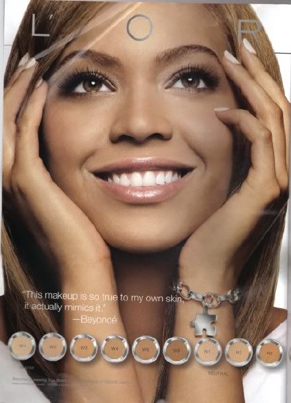
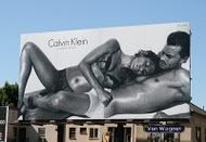
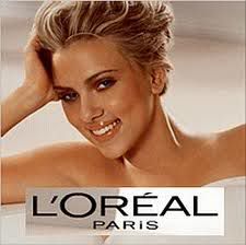
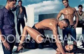
Since the past two decades, flesh showing in advertisements has become very common. Brands show these perfect photo shopped models having beautiful bodies and faces that urge people to try and look like these models. These ads are merely images accompanied by few words, targeted at the human desire of looking better. 
Even though the amount of words in these ads is very less compared to images, but it is enough to make a person invest in the product. There are two reasons for lesser words in advertisement, one that people don't have enough time to read a lot of text, and second is to show people something that urges them to make a decision from heart and not from brain. 


Some of the examples are below:

This example also shows that there is no need of words because the photo shopped image of Beyonce will be more than enough to make people buy this product.


Images taken from Google Images


Images taken from Google Images



Images taken from Google Images


Images taken from Google Images



Images taken from Google Images


Images taken from Google Images
Monday, November 29, 2010

Dangerous Designs:

Bridges are import means of commute over rivers, roads and valleys. There are hundreds of bridges in the world; some having very complex designs while others has simple architecture. It is a big responsibility for a designer of a bridge to make a design that doesn’t have any flaw in it.
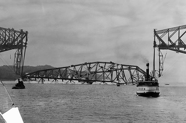
A bridge collapsing due to bad judgment or design flaws becomes a source of much embarrassment as it is treated as major news. OnAugust 29, 1907 a canter bridge near Quebec CityCanadacollapsed resulting in the untimely death of around 75 people.

The Quebec Bridge of Canada, was built to connect south shore of the St. Lawrence river in Levis to the north shore at Quebec city. The bridge construction was started in 1903, it was almost completed in 1907.
The Head Engineer of the project was Theodore Cooper who was one of the most respected bridge builders at the time.

Original design of the bridge consisted of a superstructure weighing a total of 62 million pounds with two main supports placed 1600 feet apart. This design was modified before construction was to begin and the distance of two main supports was increased from 1600 ft to 1800 ft. The designer also altered the specifications in a way that would allow for higher unit stresses.
These design changes were made with out conducting any preliminary tests or research studies.


Finally when the construction started in 1904 the designer due to health issues was only able to visit the site three times. An unqualified person Edward Hoare was made the responsible engineer at the site.

During the construction some problems were observed but downplayed; like the actual weight of steel put into the bridge had far exceeded the planned weight, and compressive chords of the south cantilever arm were bent. It was also noticed that the deflection in another chord increased from three-quarters of an inch out of line to two and one-quarter inches in just a week’s time, but construction wasn’t stopped.

The reasons for failure were inaccurate theoretical estimates and unchecked changes to the design. The Royal Commission conducted an enquiry in to the collapse and attributed the failure to defective design and errors in the judgment of the designer. This practically ended Theodore Cooper’s career as he announced his retirement.


Image taken from Google Images.


pastedGraphic.pdf


Image taken from Google Images.

How Color transforms a design?

Colors are an essential part of our lives and the prospect of life without colors is very depressing. How would it feel if we have to see and wear only one color everyday? If we walk down the road and see everything in white and black colors?

The truth is that color gives meaning to our lives and helps us to express and execute our thoughts, ideas, feelings, and plans in short; colors transform designs that are in our minds in to reality. Considering this one can conclude that colors can tell us a lot about the design and also the designer. 

The way we use colors in our designs, tells people a lot about us. So when we are designing something we should keep in mind the basics of a good design. Harmony is something that is pleasing to the eye. It engages the viewer, creates an inner sense of order, and provides balance to the visual experience. When something is not harmonious, it's either boring or chaotic.

The human brain rejects what it can not organize, so while designing we have to keep in consideration that colors are not overly used, if we use too many colors it will destroy the look of the design and viewers will grow weary of it.  Color harmony not only delivers a visual interest, but also gives a sense of order.
A good design is a combination of color values ranging from light to dark. A good design is an amalgamation of values that are close together to give the design a calm appearance, and value contrasts to show texture and as an effective means of directing viewer attention in a composition.
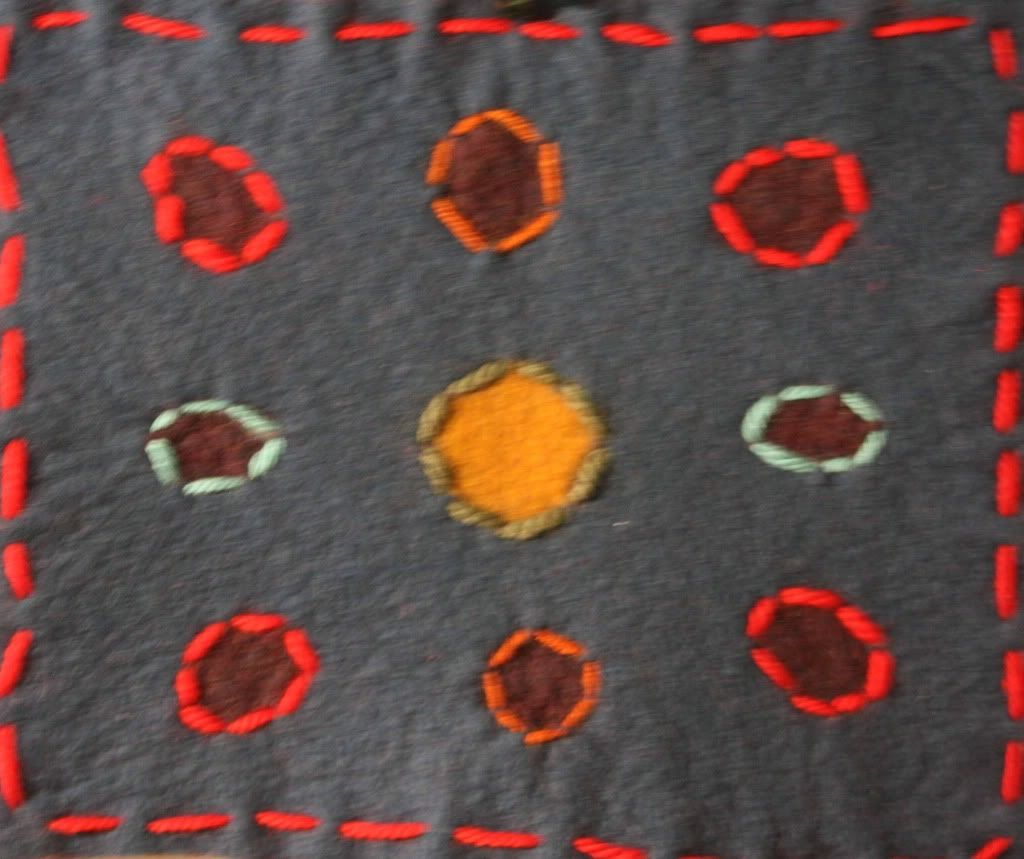
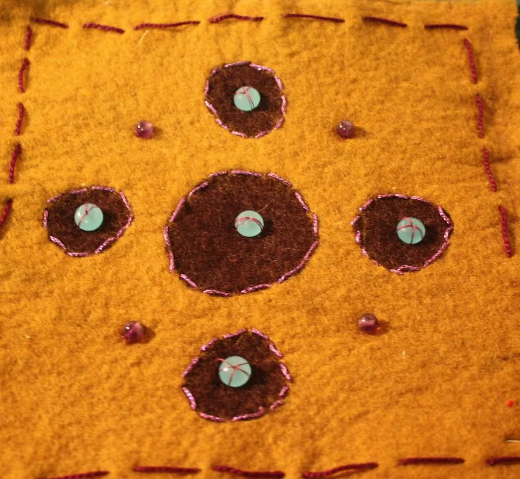
When I was doing a felting project for my design class, and we had to use a packet of felts all of which were in different colors. I picked the colors considering the pattern and colors were not scattered, they were felted together in harmony. I did not picked the white, black, brown or gray colors because they restrict the imagination and flow as compared to brighter and warmer color like red, green, orange and yellow. These warm colors are very appealing to the eyes but should be used with some cool colors to harmonize the design.


Example of this children’s book shows how colors can transform the entire look of a book, the black and white cover page of this book wont attract kids as much as the colored one. This is because children are attracted towards colors since infancy. A book with colors will sell a lot more than a one without colors.


image taken from Google images


image taken from Google images


Images taken by me, Faizan Dar


Images taken by me, Faizan Dar


Images taken by me, Faizan Dar


Images taken by me, Faizan Dar

I have made this illustration to show that how design looks with colors and without colors, and what it how colors make something looks good.


Image designed by me, Faizan Dar
UTOPIAN DESIGN

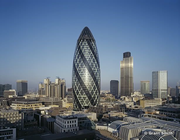
The Gherkin, London’s famous Skyscraper ( also known as 30 St Mary Axe Commentary) is located in the main financial district of London. It was designed by Sir Norman Foster and is one of the most dramatic landmarks in London. It won the Royal Institute of British Architects (RIBA) Stirling Prize in 2004. The Gherkin is 180 meters tall and has 40 floors. Skanska was responsible for the construction which took place between 2001 and 2004.

It is said to be London's first environmentally sustainable skyscraper. Its design was inspired by the ideas that were used in the Climatroffice design with Buckmister Fuller in the 1970s. It in turn has moved sustainability forward in the construction industry and has inspired the designs of other buildings, including Foster’s Hearst Tower in New York.

This building consumes 50% less energy than a typical skyscraper.
Low consumption of energy is achieved due to the diagrid structure, a grid of diagonally interlocking steel elements, used in its construction. Energy saving methods that are used in this building not only allows the building to use half the power that a similar tower would typically consume, but also provides pleasant and refreshing environment to its occupants.


Each floor of this building has gaps which creates several shafts. These shafts are useful for several purposes, such as they serve as a natural ventilation system for the entire building; they create a giant double glazing effect; air is sandwiched between two layers of glazing and insulates the office space inside.

The shafts drag the warm air out of the building in summers and this process warms the building in the winter, this process takes place using passive solar heating. These shafts perform another operation that allows sunlight to pass through the building, which saves energy and it keeps the lighting costs down, while making the work environment more pleasing.

This building has spiralling light wells that allow daylight to flood down onto the floors, as well as being an integral part of the ventilation strategy and saves up to 40% of the year. This allows the building to operate without full air conditioning at certain times of the year.

The building’s unique form is a response to the constraints of its site. Its shape appears less bulky than a rectangular block, creating public space at street level. It also offers minimal resistance to wind, improving the environment for people on the ground and reducing the load on the building.

The slim base and top also reduce reflections and improve transparency, and the floor-to-ceiling windows improve daylight penetration over a conventional building. The building’s shape also means that it does not need extra reinforcements to add stiffness to resist wind load. The shape of the structure provides the stiffness required.

This unique structure has been admired due to its revolutionary style utopian approach. If all the building are like Gerkin, a lot of energy will be saved while people can enjoy the designs.


images taken from google images.


images taken from google images.

Monday, November 15, 2010

Elegant Gadget

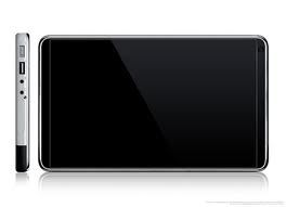
New products are introduced in the market everyday but it is difficult to find a product that fulfills good design requirements. These design requirements include esthetic quality, safety, performance and comfort. A good design is one that looks nice, is easy to use, has good performance, is physically comfortable and yet safe. Apple has brought a revolution in industrial design due to its exquisite products and as a result a huge market following for them has developed around the world. Most of Apple products did extravagantly good when they came in the market, from Ipod nano to Ipod touch from Imac to Macbook pro, from Iphone to Ipad and the list goes on. The reason behind their success is Apple’s investment in to research on what people want, They create products that are stylish and at the same time are very easy to use. Not everyone can afford to have most of the Apple products, but everyone wish to have one. Ipad is one of Apple’s products that recently hit the market, it does fulfill most of the criteria of a good design, but at the same time it has some flaws.

Ipad is a recent addition to the Apple family. It is an elegant gadget that Apple has introduced. Ipad’s build quality is excellent, the aluminum back feels great under the finger and nothing feels cheap. Apple has always focused on people’s desire, from a good style and decent colors to graceful shape and design. In this product they have given greater importance to aesthetic sense.The iPad is heavier as it is 1.5lbs to 1.6lbs (3G), it is not physically comfortable to hold it continuously for a long time.The contrast and colors are very good. IPad has made life easier as it is good for web browsing, emails, news, comics, watching movies while traveling, maps, can serve as a digital photo album, but at the same time is not good for Gaming, Productivity applications, Writing reviews. Instant messaging. iPhone or an iPod touch users might find it similar.
There is an audio jack connector for headphones, and a microphone for applications that need it. It is not really easy to type long emails on a touch screen. The speaker is on the bottom of the device where the "Home" button is.

It has Applications like iBooks, Comics, Magazines, USA Today, BBC, Wall Street Journal, Bloomberg, Netflix,YouTube, Music (same as ipod), email, calendar, Iwork, Games, adobe ideas, The web browsing experience is very like the one on the iPhone/iPod touch, but a little faster, and with a much more comfortable display.

The WiFi chip of the IPad is faster than the iPhone's,The custom iPad A4 processor consumes very little power, so in most cases, the display will be the largest drain factor on the battery. Local storage video: 10+ hours, Book reading:11-12hrs.
The battery is not user replaceable, and like most batteries, it might lose its charge capabilities or simply die after a while. It is not really economical to replace a new battery.

Ipad has some flaws, like there is no camera, no USB ports, no app-based music in the background, no data crunching in the background, Virtual keyboard is not as productive as a real one, No Flash, AT&T-only (in practice), no widescreen.

Over all It is a great product, in future Apple will definitely come up with Ipads that fulfills all the requirements.


Images taken from Google Images.

Sunday, November 14, 2010

Unique Architecture

People from every era aspired to create something different and unique. They wanted to express their imagination and prove their abilities. Architects from all around the world have been making extravagant buildings, that doesn't only serves as a shelter for someone, but also serves as a master piece for the representation of their culture. It does not only amuse people from that era but also serves as the historical landmark for future civilizations. There are many examples of such buildings that continue to indulge our imagination, such as the Great Pyramids of Giza, Great Wall of China, Taj Mahal, Hagia Sophia, Notre Dame Cathedral and many more.

Architects of our era like their predecessors are trying to leave their mark on history through magnificent and unique designs. Some of these buildings are mind blowing and weird in a good way.

Following are examples of these incredible buildings:

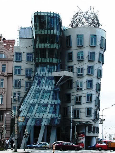
1.The Crooked House:
This building is located in Sopot, Poland. The architect of this building is Polish. The design of this building makes it looks like that it is shaking or dancing.


Image taken from Google Images

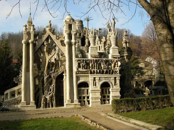
2.Ferdinand Cheval Palace a.k.a Ideal Palace:
This building is located in France. It is named by its architect Ferdinand Cheval (1836 – 19 August 1924). He was a postman who spent 33 years of his life building an "Ideal Palace"


Image taken from Google Images
3.Stone House:
This house is located in Guimarães, Portugal. It’s a unique architecture, which is very close to nature.


Image taken from Google Images
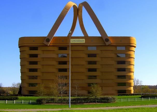
4.The Basket Building :
This building is located in Ohio, United States. Its a big basket which serves as a human shelter with a very interesting design.


Image taken from Google Images
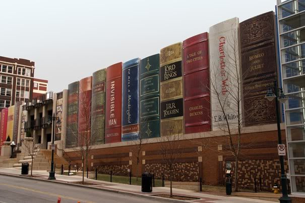
5. Kansas City Public Library:
This is a library building in Missouri, United States. Anyone can tell that its a library by looking at its design.


Image taken from Google Images
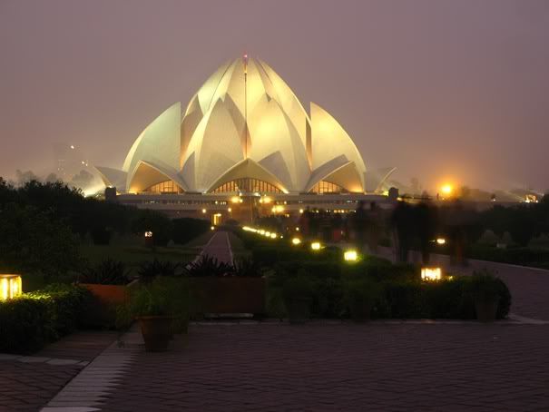
6.Bahá’í House of Worship:
This building is located in Delhi, India. It’s also called a lotus temple, as it is shaped like a huge lotus flower.


Image taken from Google Images


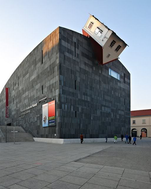
7. Erwin Wurm, House Attack:
This building is located in Viena, Austria. The design of this building shows that the house was thrown on this building.


Image taken from Google Images

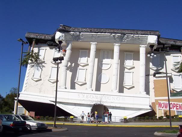
8.Wonderworks:
This building is located in Pigeon Forge, TN, United States. It looks like a Roman building thad has been thrown up side down.


Image taken from Google Images

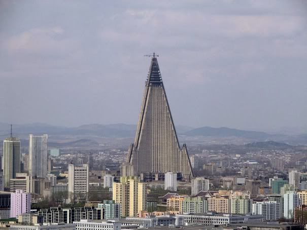
9.Ryugyong Hotel:
This building is located in Pyongyang, North Korea. Its pyramid looking design is very attracting.


Image taken from Google Images

Monday, November 8, 2010

Word and Image # 2

How Words and Images work in an advertisement?

The world of advertisement in the twenty-first century has transformed drastically. New technology has changed the relation between words and images. Extensive software like Photoshop and Illustrator have brought a magnificent change in the field of advertisement. Advertisement today contains fewer words than images.

Most of the big brands now a day put their emphases on their advertisements; hence they put a huge amount of money in these ads. There is a cluster of brands and their advertisements all around us, from magazines to billboards, TV channels to news papers etc. People are so busy that they don’t have enough time to see every ad. Majority of the people get attracted by the products by looking at the picture in an ad and not by reading the text, and if the add is really appealing it will force the people to invest in it.

A lot of flesh showing in advertisements is very common now. Brands show these perfect photo shopped models having beautiful bodies and faces that urge people to try and look like these models. Most of the time these images are accompanied by few words which says that this product will change your life or it will make you stand out from others, or even will make you look like this particular model.

Even though the amount of words in these ads is very less compared to images, but it is enough to make a person invest in the product. There are two reasons for lesser words in advertisement, one that people don't have enough time to read a lot of text, and second is to show people something that urges them to make a decision from heart and not from brain.

Some of the examples are below:


This example also shows that there is no need of words because the photo shopped image of Beyonce will be more than enough to make people buy this product.


Image taken from Google Images


This actress is endorsing L’Oreal, as you can see there are very few words in this ad, people are going to get attracted by the model to buy this product. They will think that if this model has used this product then it should be good. Brand achieved its goal without putting a lot of words.


Image taken from Google Images

In this example Jessica Simpson is endorsing Proactive, showing people that the product will make them have a perfect skin likes here.

Image taken from Google Images


In this add there are no words at all, because this ad is targeting teenagers and only the picture of Justin Bieber holding proactive bottle is enough to sell it.  


Image taken from Google Images


In this Dolce & Gabbana advertisement, the emphases is on perfect bodies, and how clothes look good on these bodies. There is no word other than the brands name in this advertisement, the focus is only on the image.

Image taken from Google Images

Similarly in this advertisement which is of a different brand, the focus is on image not on words, the perfect bodies make the clothing looks good which targets the goal of selling more products.

Image taken from Google Images