Word and Image # 2 (redone)
How Words and Images work in an advertisement?
Modern day advertisement industry has become a set of multiple artistic audio-visual, design and creative works. A blend of numerable efforts put in by a team of experts in each departs; enable an ad that finally gets approved in the complex scenario of brand competition. Brands are in a continuous rigorous race of captivating market share. In this scenario, an influential ad helps to build, revive, regenerate or re-invent the image of a brand. Its words, imagery, video and art work remarkably help the brand personality in the long run.
The today’s computer-aided age; new technology has changed the relation between words and images. Extensive software like Photoshop and Illustrator (many others) has brought a superlative change in the field of advertisement. TV, billboards, news paper, and magazines advertisements today essentially contains fewer words than images. No ad made can go online or printed without electronic alteration. However, radio remains is only a word game, where linguistic arts have an unchallenged monopoly. Advertisements have become a part of our daily routine. Most of the big brands control mindshare due to these images that they have been able to built in our minds in decades with the aid of their advertising campaigns. Companies allocate huge budgets into advertisements.
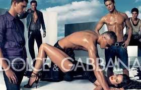
Due to the fast-track life of people, it is not possible to read through ads. Therefore, art work in advertisement field has taken un-challengeable position. As pictures speak louder than words, therefore these ads are invested in and crafted with brilliance of pictorial, imagery and art work ideas. These images explicated in advertisements are self explanatory, so that people are able to get an idea instantly by looking at the image. However, there are certain highly creative advertisements made, which can attract, rise curiosity and reflexes of viewers and passersby. These advertisements are purposely made to stimulate curiosity and sometimes other emotional feelings such as; love, hatred, erotic etc. most viewers are unable to avoid dipping into the gravity of these ads. such ads are able to create unforgettable and lasting images into the minds of the viewers, consumers or even the potential customers.
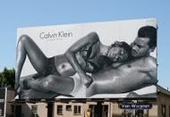
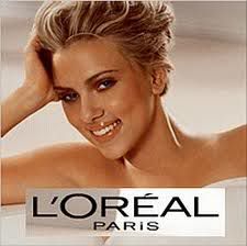
Since the past two decades, flesh showing in advertisements has become very common. Brands show these perfect photo shopped models having beautiful bodies and faces that urge people to try and look like these models. These ads are merely images accompanied by few words, targeted at the human desire of looking better. Even though the amount of words in these ads is very less compared to images, but it is enough to make a person invest in the product. There are two reasons for lesser words in advertisement, one that people don't have enough time to read a lot of text, and second is to show people something that urges them to make a decision from heart and not from brain.
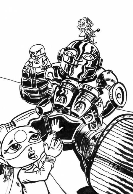
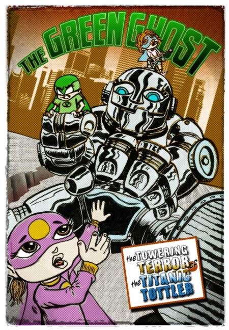
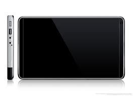
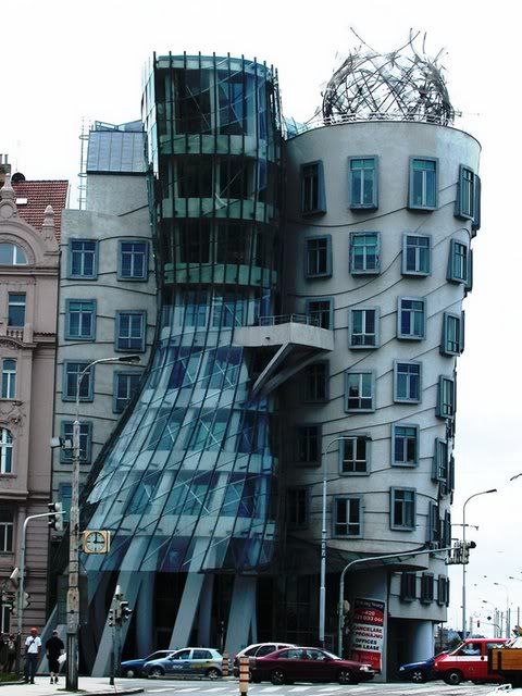
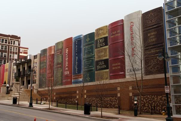
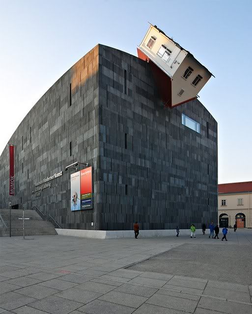
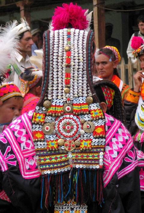
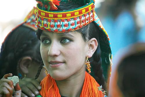
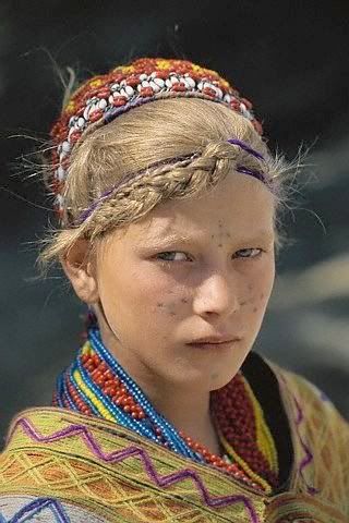
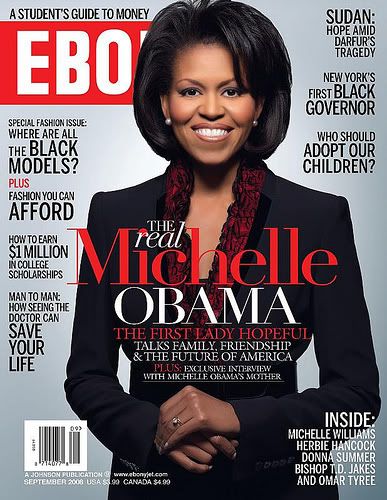
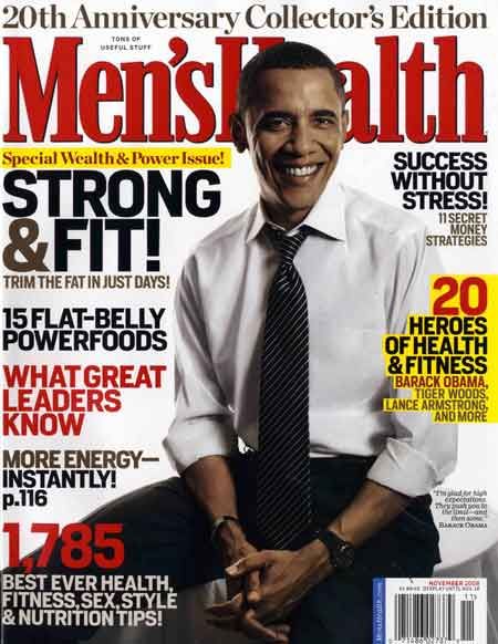
Some of the examples are below:
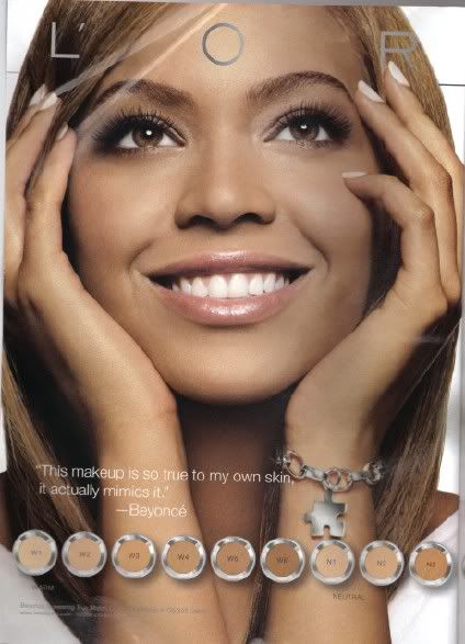
This example also shows that there is no need of words because the photo shopped image of Beyonce will be more than enough to make people buy this product.
Images taken from Google Images
Images taken from Google Images

Images taken from Google Images
Images taken from Google Images

Images taken from Google Images
Images taken from Google Images